Case Study. Editorial illustration.
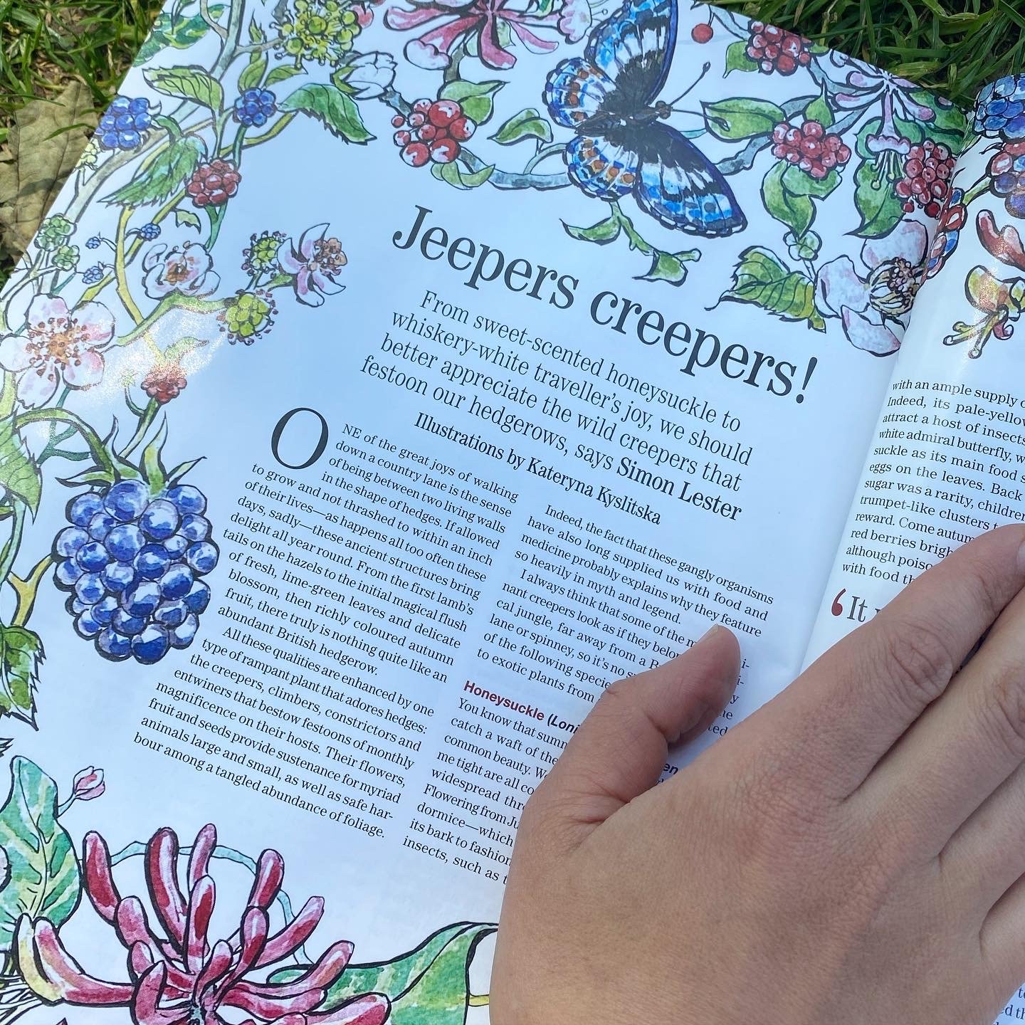
This was my first commission for Country Life Magazine, so it’s natural to start Case Study series from it. I will try to share my process as step by step as possible.
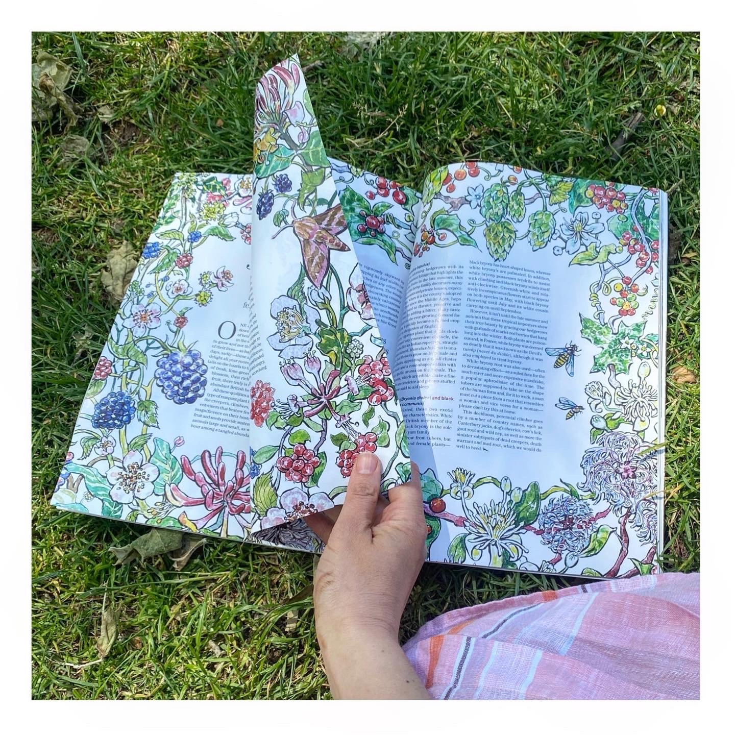
Here is how I start most of my commissions. An art director emails me a brief description of what they want, the mockup of the page, the article itself and the references. Then I do a very rough sketch, photograph it with a phone and email it back to make sure I’ve understood everything correctly. In case of this project, the frame of interwined creeping plants was required. The sketch of one of the spreads looked like this.
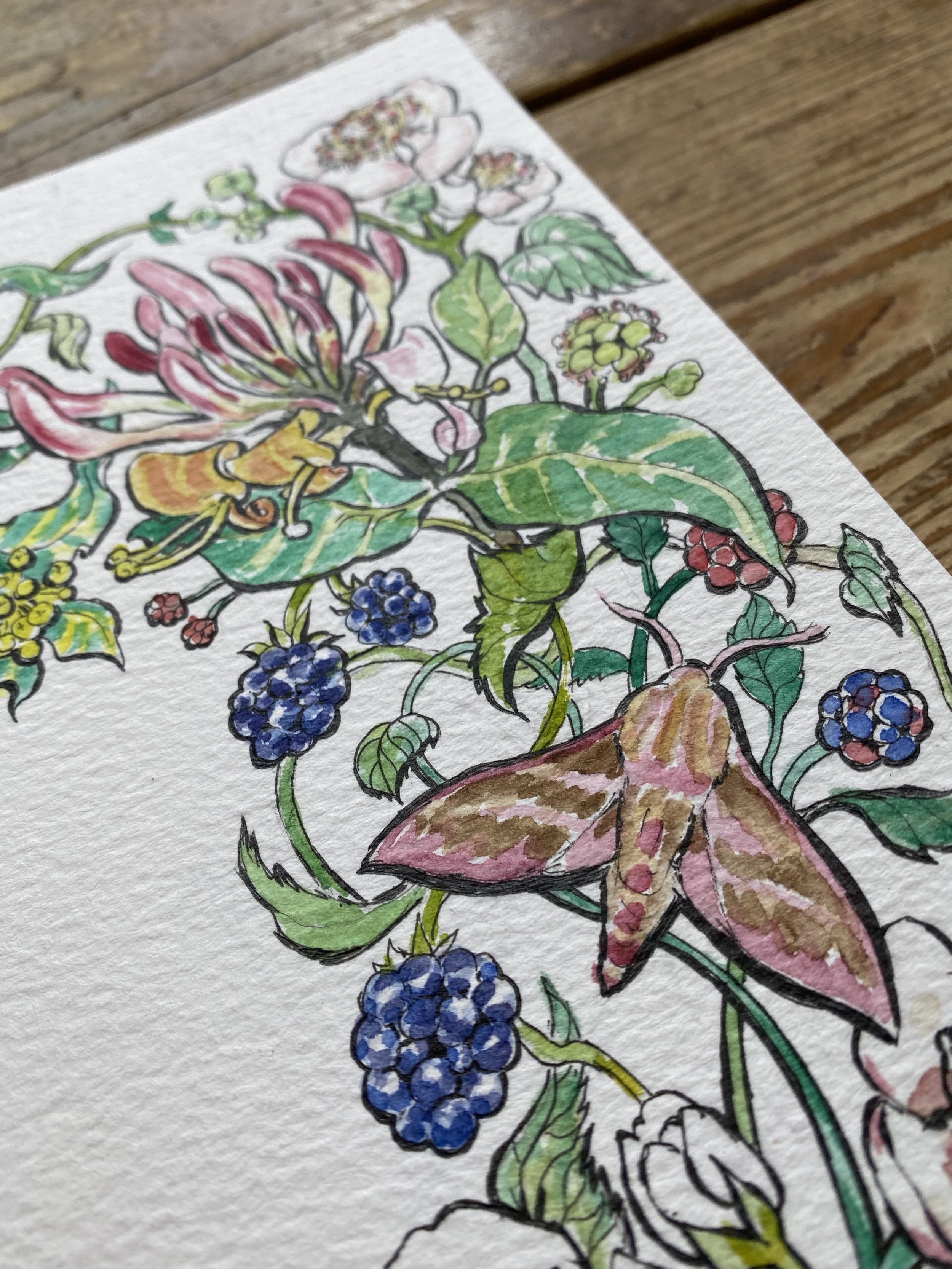
Once the roughs are approved I can start drawing the actual piece on a textured watercolour paper (I use Winsor & Newton). I photograph work in progress on different stages as some changes may still be required. For example, at some point the art director decided to ditch the door-mouse - you can see it on a rough sketch, but won’t find on the final artwork.
At the same time I do a lot of research on each plant. I need to see how it changes from the moment it starts to bloom to the moment it fades away, how it looks from different angles, what colour and shape variations it has.
After I finish drawing and colouring (I use watercolour paints from W&N) I do extra layers of contouring (with a Muji pen), which is the most boring part of the job, but creates the effect that I like and consider a feature of my style. Then I photograph the finished piece and edit it in Photoshop. I don’t add any new elements usually, just sort out the Brightness/Contrast levels/black points and remove all the background. In a detailed illustration like this it takes quite some time, but other designs can be edited much quicker.
The magazine gets a file that looks like this, a psd format on a transparent background. I see it in a printed version only when the issue comes out, usually it is a couple of weeks after I submit the files.


